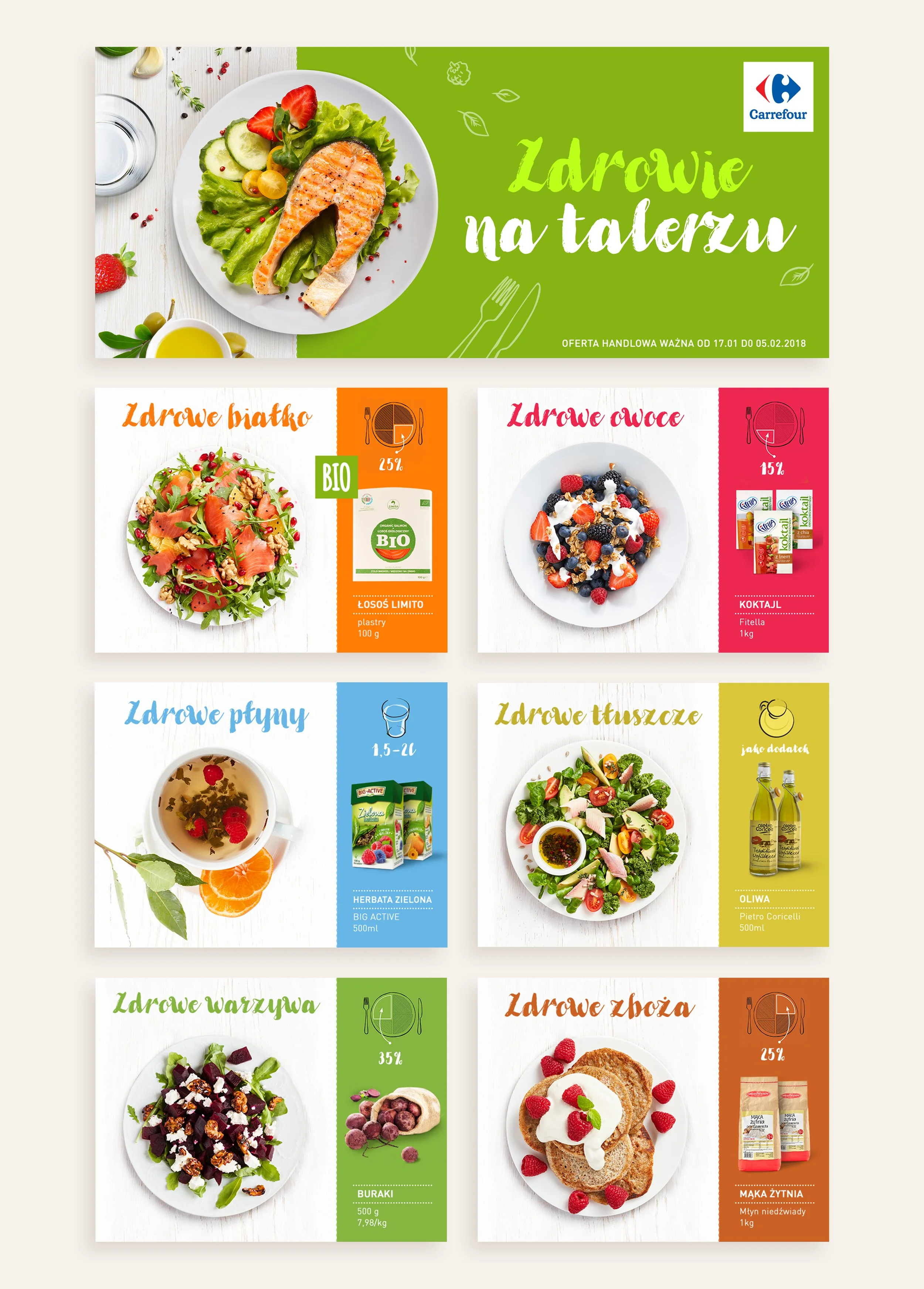
Carrefour The Health on the Plate
The Health on the Plate campaign was intended to remind us how the proportions of individual food groups in the meals should look like, and to present healthy, natural products available in the Carrefour shops. The banners contain drawing icons showing what percentage of liquids, fats, cereals, protein, vegetables and fruit should be on the plate. In addition, promoted products are presented, as well as an idea of how we can use them to create a tasty, healthy meal. The bright and vivid colors that I used in banner designs will put you in a good mood and inspire you to make your own culinary experiments.
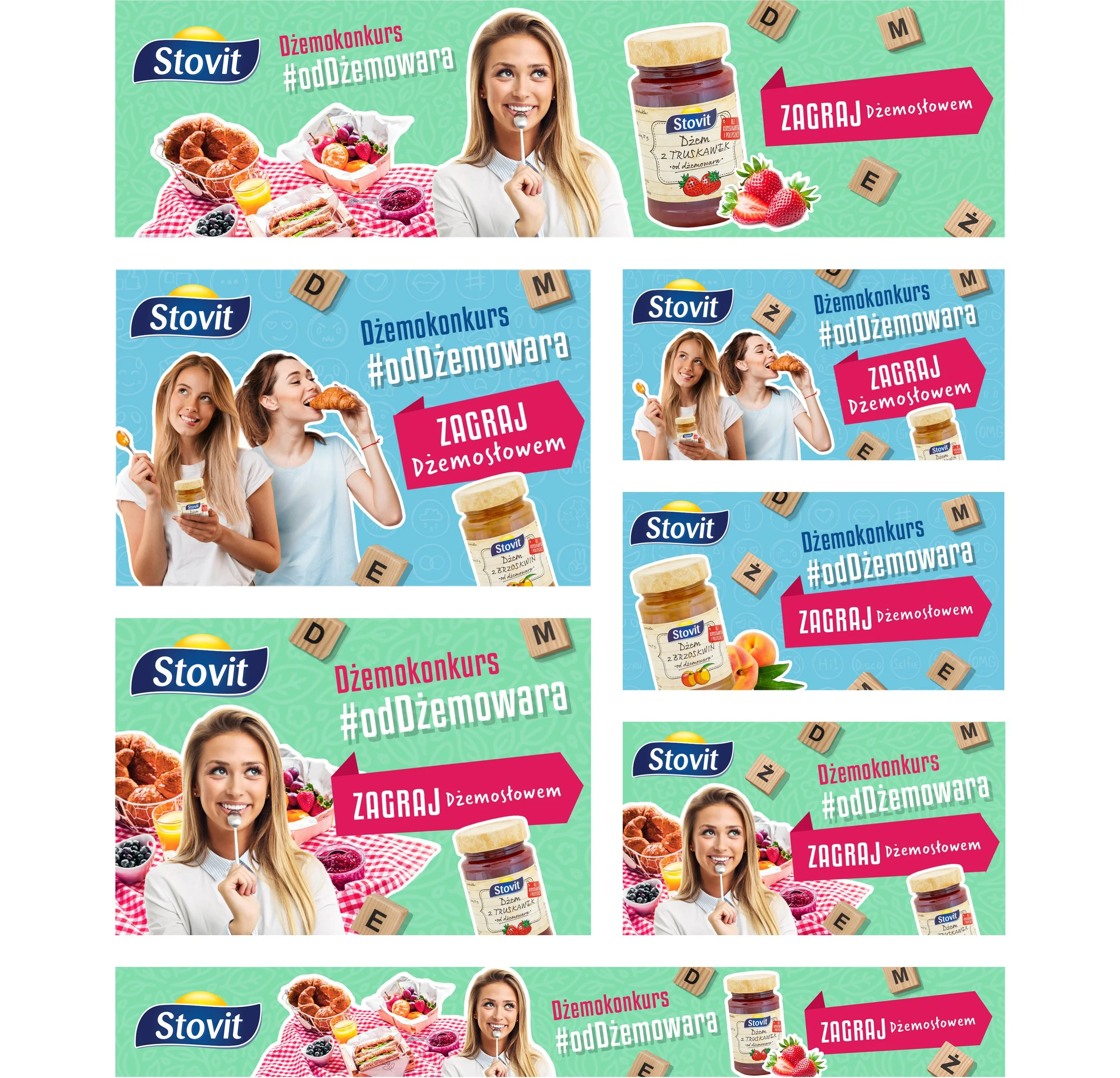
Stovit
The Stovit product portfolio is filled with fruits in various versions, such as jams, marmalades. My task was to design yummy banners in various formats to advertise the brand's new word game contest. The CTA button is the main eye-catcher thanks to its pink color and large size.
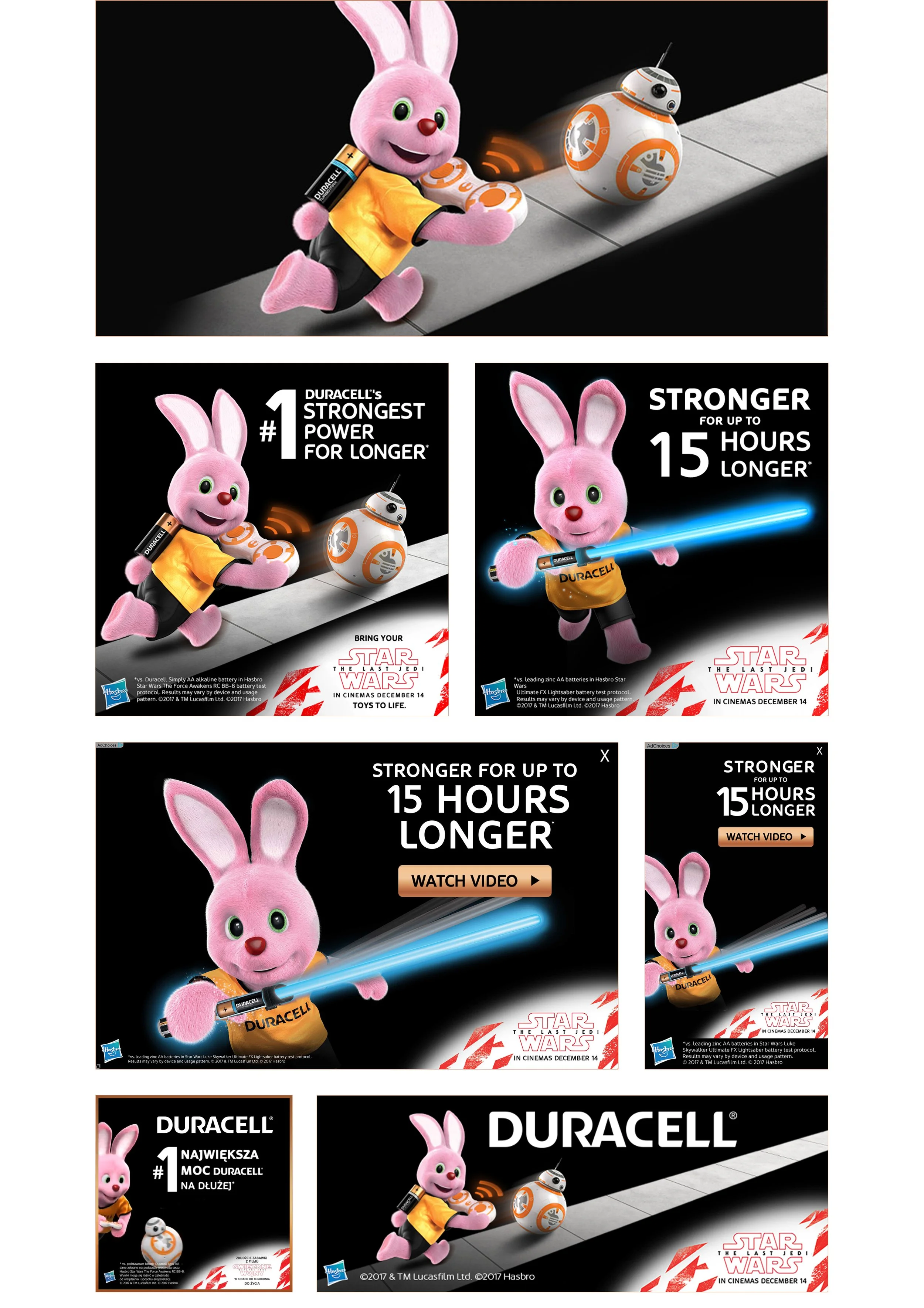
Duracell Star Wars
In this campaign, Duracell joins forces with Hasbro and Star Wars. My task was to design numerous imedia banner formats. The biggest challenge was to fit the disclaimers while maintaining legibility and keeping the appropriate proportions between the logotopes of all partners.
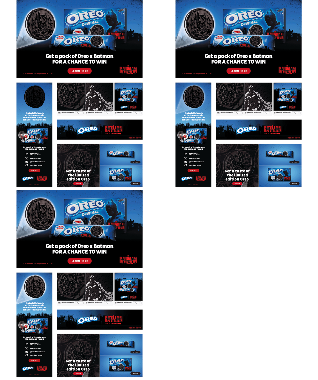
Oreo Limited Edition
Oreo was about to launch the new edition Limited-Edition 'The Batman' Cookies. The original Oreos were given a makeover replacing the classic patterns on the black crackers with artwork of the Dark Knight. The exterior packaging has also been modified, displaying an image of Gotham City, riddles printed on the packaging, and bat signals that promise the chance to win special prizes. My task was to create a wide range of digital formats that were consistent with the language of the campaign and encouraged people to take part in the competition.